London: new beginnings for Design Museum
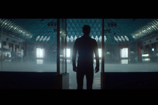
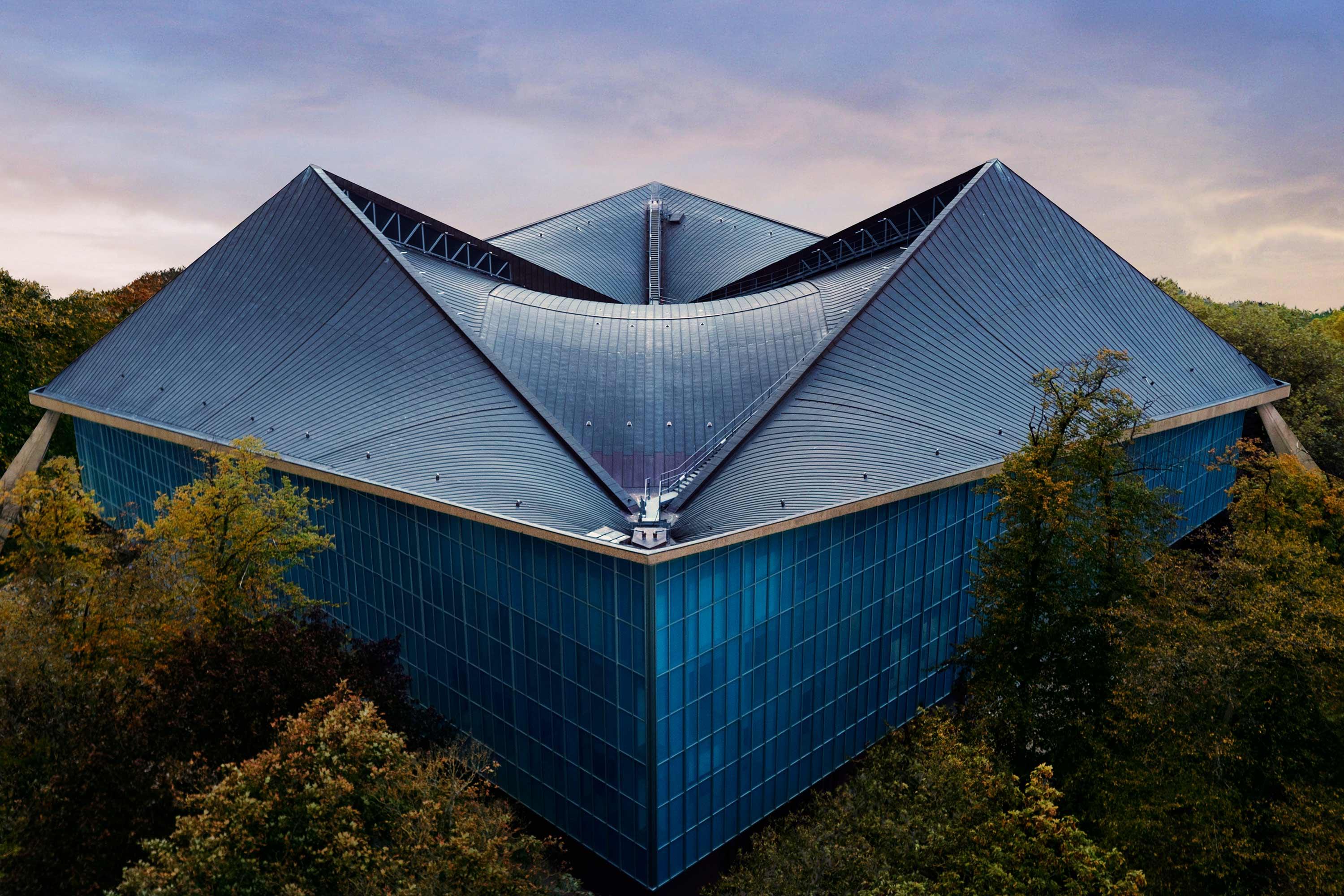
Wow, what a roof and interior; the spirit soars when you look up and around you once inside London’s new Design Museum, which has moved from its old riverside location to this glorious new home overlooking Holland Park. We visit soon after it has opened up to the public following a painstaking conversion of the grade II* listed building, originally the Commonwealth Institute.
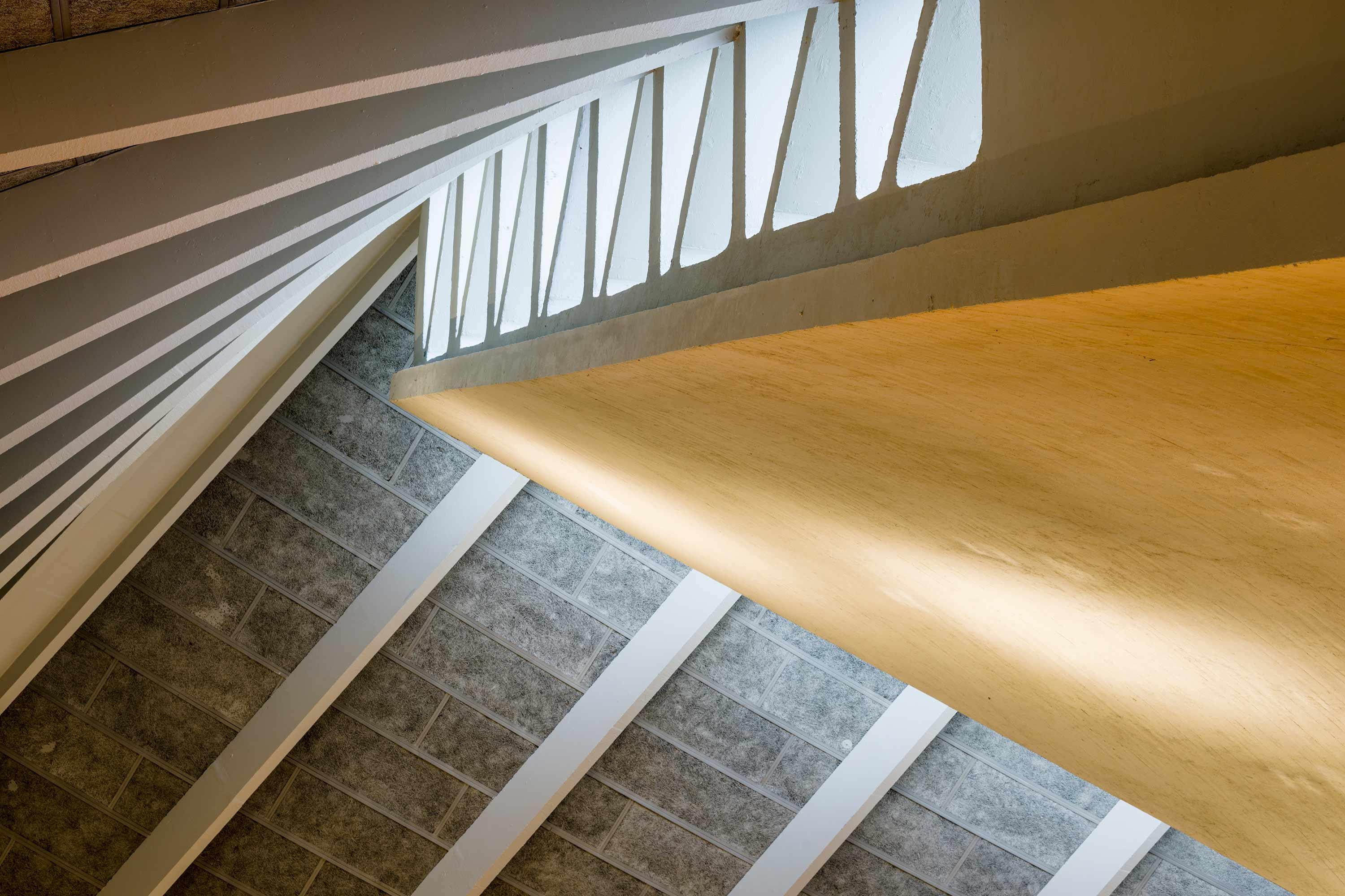
One artsy, apron-wearing staffer spots us taking some snaps of the roof and says we’ve managed to find his favourite spot in the whole museum for the best angles. We agree there should be signs on the floor reminding visitors to look up so they don’t miss it.
Before the Design Museum came along to rescue it, this 1960s modernist icon seemed to have lost its purpose, standing derelict for more than a decade. But it has now been brought sensitively back to life and transformed to a 21st century design space. Prior to its relocation in November, the Design Museum had long been in need of more space and eventually settled on the abandoned institute.
Construction work to refurbish the shell and core of the building, which took five years, included the radical process of propping up the original concrete roof (which has been kept), while the structure beneath was replaced. Its exterior has been meticulously made to resemble the original blue glass skin of the building.
The £83 million conversion, retuned by designer John Pawson, is now a beautiful blend of concrete, marble and Danish oak, alongside tactile curves, sharp angles and shadowy light, in what feels like a really sensuous space. And photography showing aerial views of the roof from outside is breathtaking.
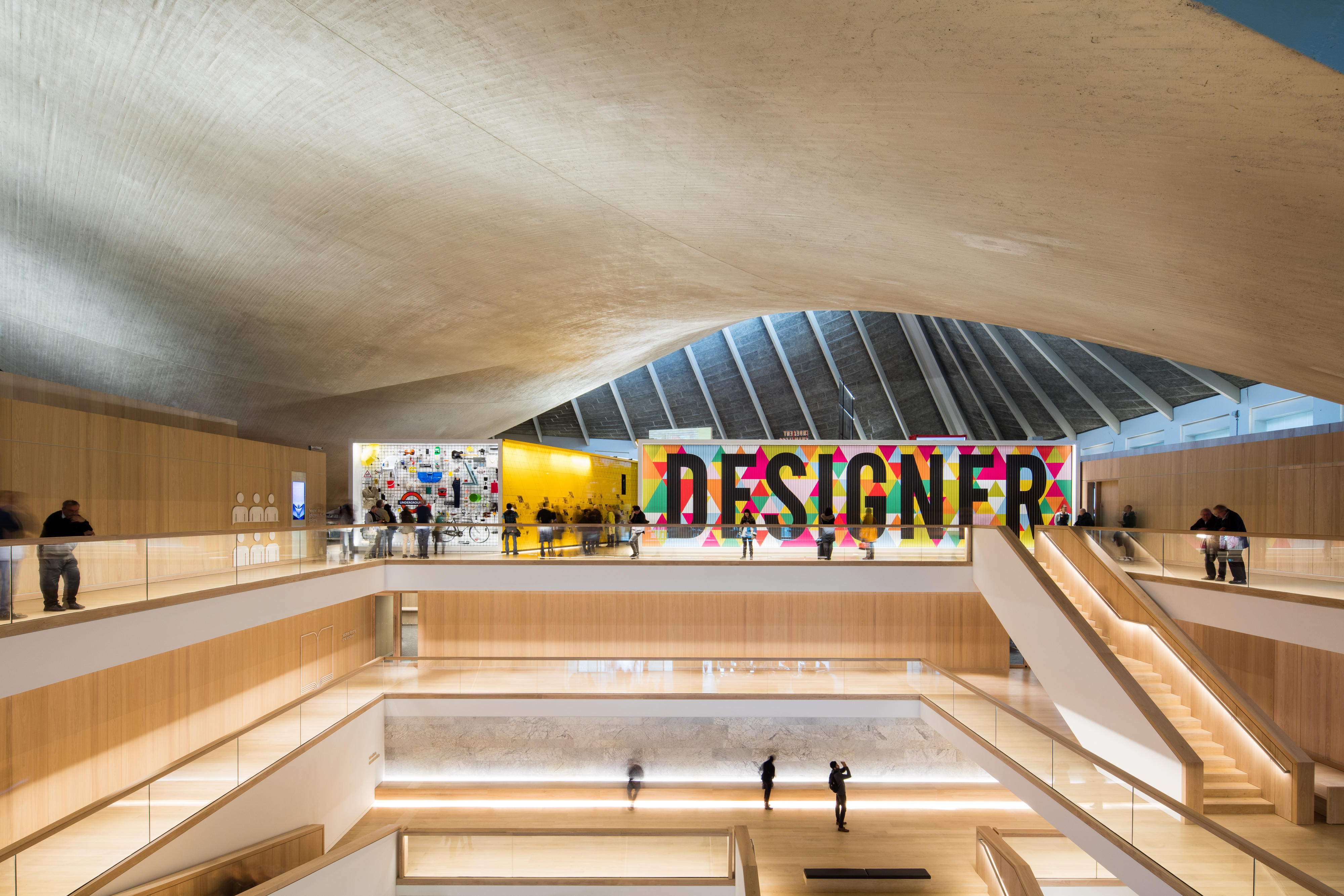
John says it is the way everything comes together – the new and the old – that gives him the greatest pleasure. “I hope the Design Museum shows people that you don’t have to tear down and start from scratch to make exciting new cultural spaces,” he adds.
Museum director Deyan Sudjic says the real work starts with the museum’s opening “because building a building is nothing by comparison with actually making it come alive”. The exhibitions need to reach out to a wider audience but also maintain the interest of people who actually know a lot about design.
“Museums are about telling stories,” he adds. “I think there’s always a tension between the idea that a museum is a place that collects stuff, a place run by people who find the public a nuisance, and those who want to tell stories. I think we do a bit of both, but it’s mainly about telling stories.”
The opening exhibition, ‘Fear and love: reactions to a complex world’, is mind boggling and embodies what those behind the new Kensington High Street museum felt about the project – fear and love.
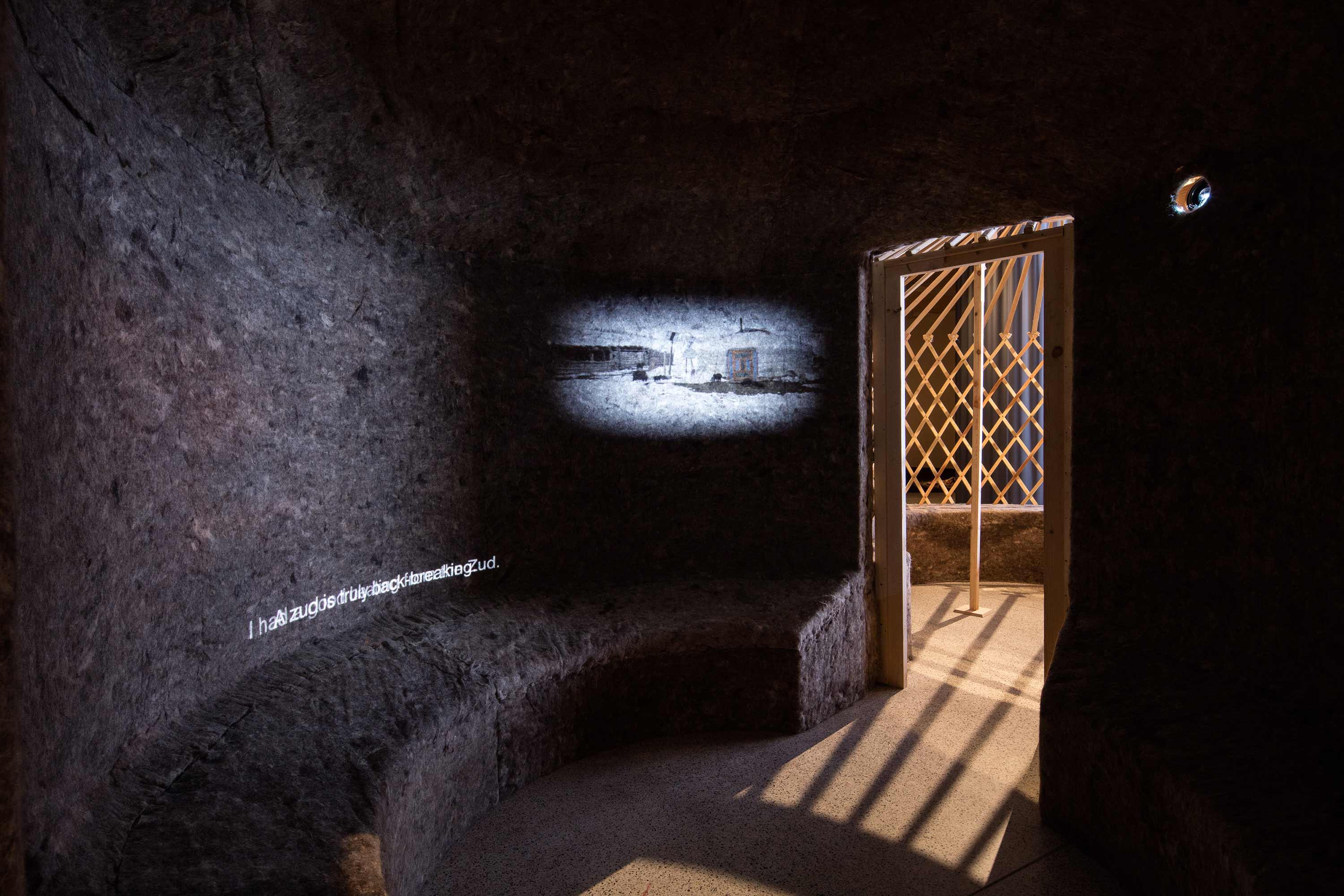
Eleven design practices from around the world congregate with their exhibitions for this show, which each explore an issue that inspires both anxiety and optimism. It’s powerful stuff, and includes an installation of a traditional Mongolian felt ger (tent), with video footage showing a vast sprawl of gers clustered around the periphery of Ulaanbaatar, Mongolia’s capital, as mass migration of rural nomads to the city continues.
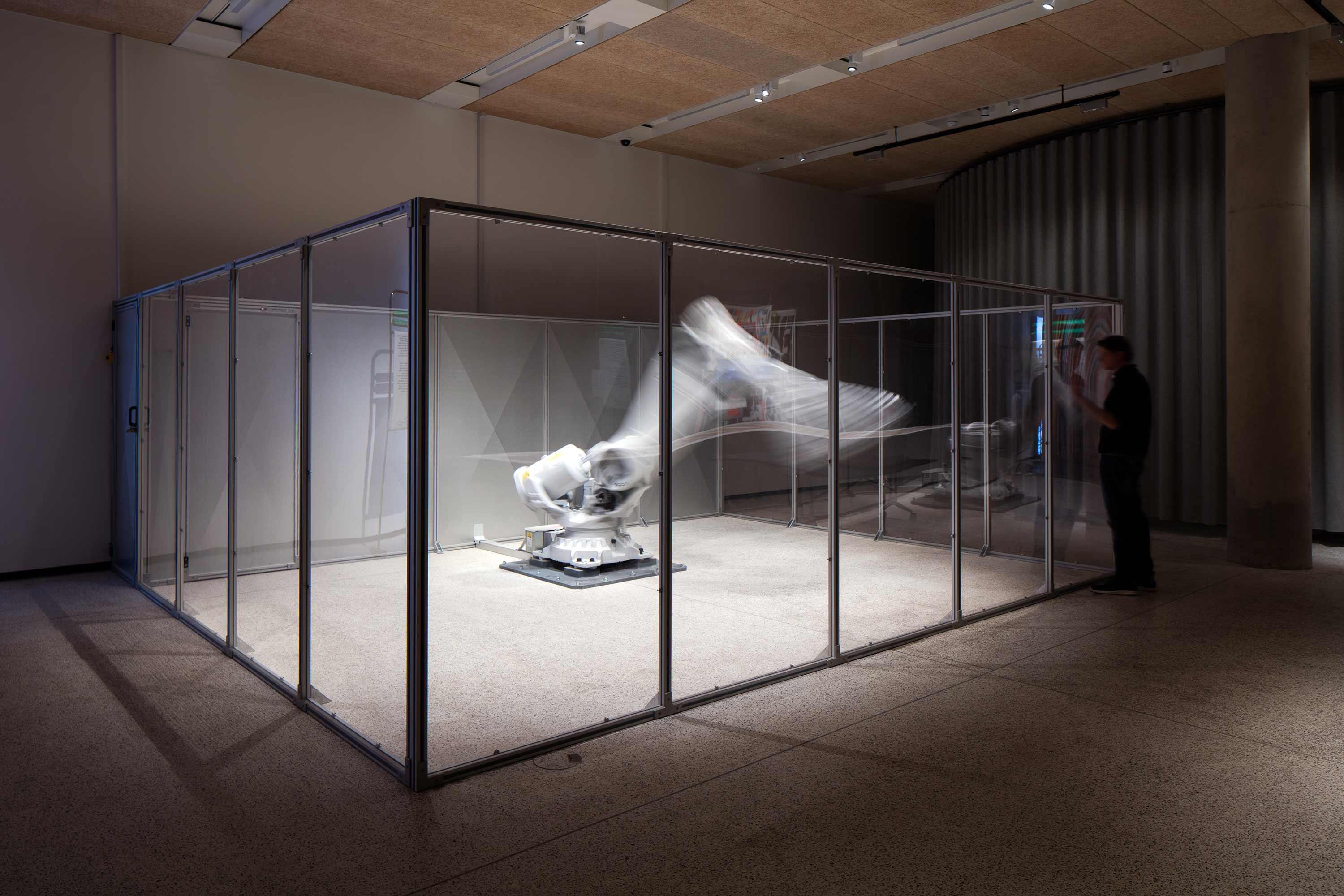
There’s a lot to absorb with this installation and the rest, which range from a rather unsettling giant robot called Mimus, reprogrammed to seem sentient, who tracks you like a puppy if she gets curious, to the Staples installation, which asks viewers to consider the staple foods that underpin civilisation.
Another thoughtful piece presents you with huge mounds of brightly coloured fibres. It’s a seductive looking scene but on closer inspection, Fibre Market appears to be a commentary on how retailers can literally pull the wool over our eyes as consumers: something many of us know even if we don’t like to think about.
For this installation, Netherlands based designer Christien Meindertsma has been working with the first generation of machines that can easily sort clothes by fabric and colour. One reason it’s apparently been so tricky to recycle clothes is because a decent sorting system has, until now, been lacking. This has meant that many items you throw away end up in an incinerator or as landfill, or if repurposed, often turned into low value materials.
Christien started off with 1000 discarded woollen jumpers. Working with two textile companies to machine-sort the clothes by fabric and colour, she shows how the fibres can therefore keep their value. The fibres are nestled together in cheerful piles, almost distracting you from the message behind the piece; which on closer inspection includes hundreds of material samples from the jumpers stuck on the surrounding walls, with original labels attached.
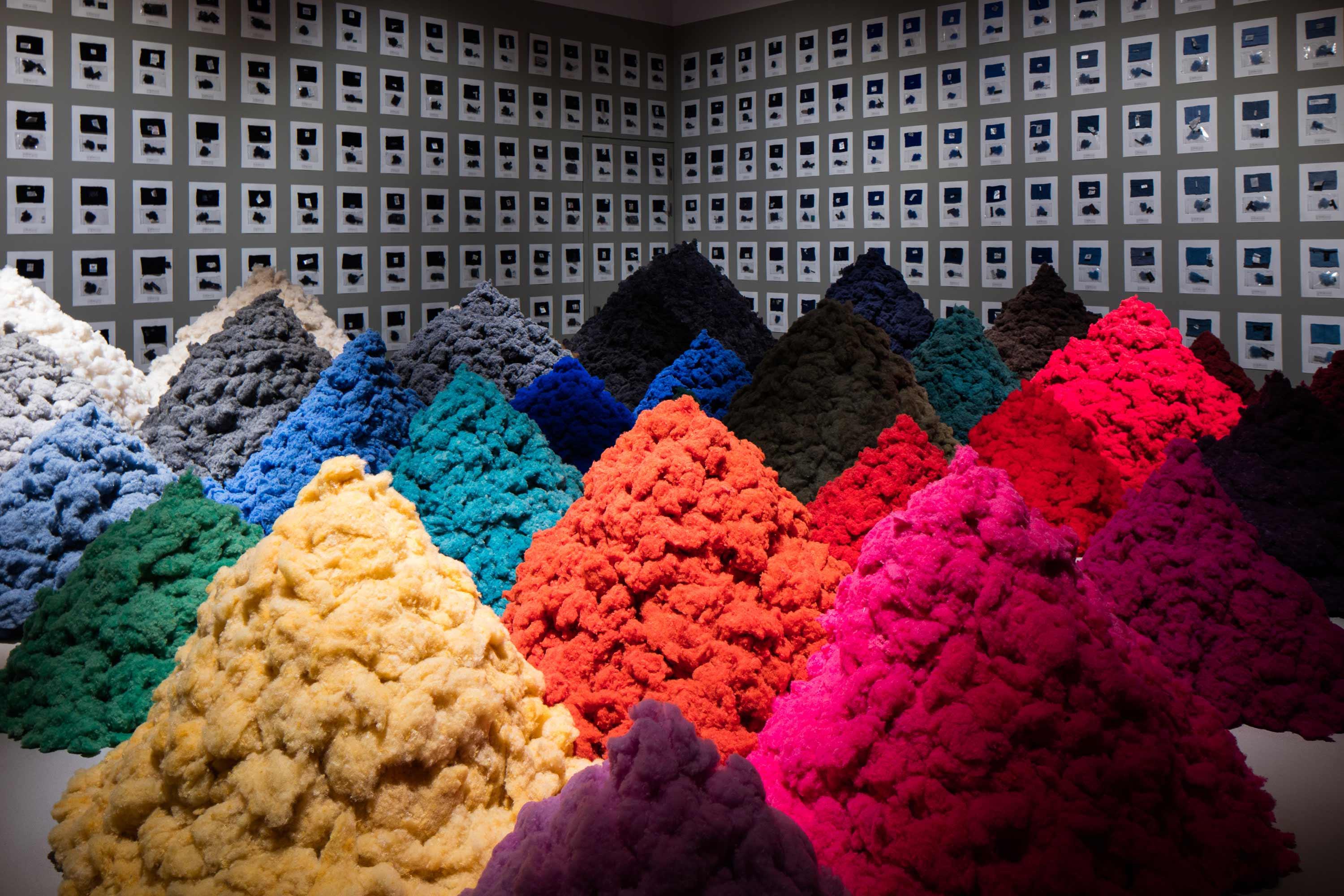
Worryingly, during the sorting process, Christien found that a lot of the labels were misleading – many jumpers claiming to be 100 per cent wool were less than 60 per cent. We shouldn’t be surprised; it’s not news that people selling things don’t always tell the truth, or at least conveniently hide it. But somehow, seeing it all laid bare on these walls, involving some majors retailers, seems worse and feels particularly poignant at this festive time of year. It makes you think hard about exactly what you might be giving people for Christmas. As well as being a critique on our fashion consumption habits and those feeding them, Fibre Market signals an opportunity for a more sustainable fashion future.
After the Fear and love exhibition, there’s plenty more to inspire and excite now that the museum enjoys triple the space than at its previous Shad Thames spot. For one, there’s the fab ‘Designer maker user’ exhibition on the top floor, which focuses on these three key people, who are the heart of any design. It explores design from the perspectives of all three, aiming to show how “designers respond to the needs of makers and users, how users consume and influence design, and how revolutions in technology and manufacturing transform our world”.
It’s a jam packed medley of almost 1000 offerings which roves between everything from architecture and engineering, to the digital world, graphics and fashion. This includes a clever sounding sensor which can be attached to plants and sends information in an app to growers, enabling them to make quicker, better decisions about day-to-day farming needs and reduce the use of resources such as water and fertilisers.Other sustainably focused designs include the Fairphone, a modular smartphone where users can tinker with repairs themselves, extending its lifespan. It also claims to use fewer raw materials, produce less carbon emissions and electronic waste, and go to “extraordinary lengths to map and understand the sources of its raw materials, seeking out fair trade and conflict-free alternatives”.
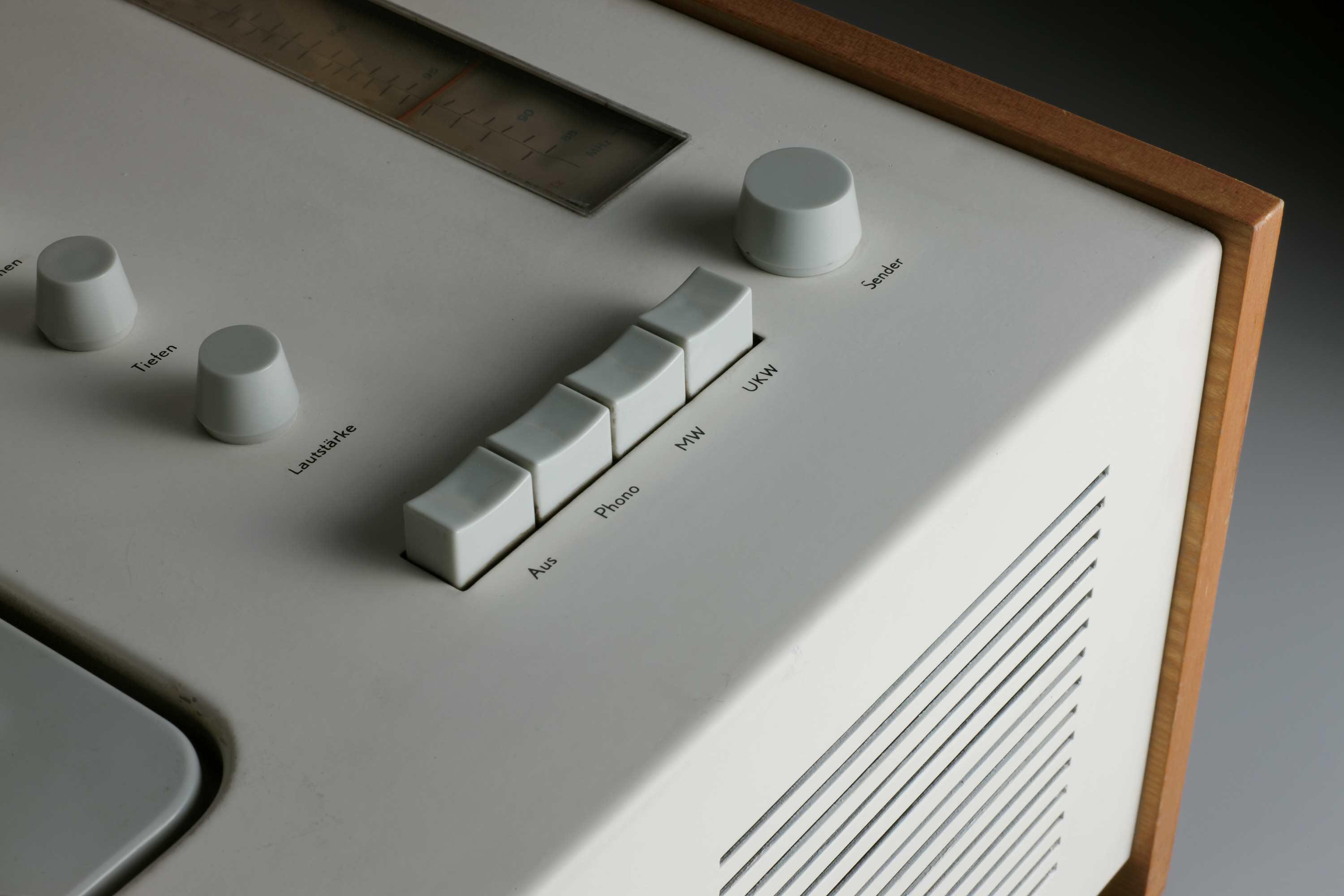
Ethical manufacturing and true craftsmanship certainly jostle up against dozens and dozens of mass produced techie items crammed into the exhibition, which really makes you stop and think about our consumption and environmental drain on the earth, as well as the moral responsibility of designers.
Another moving display shows two prosthetic limbs, from e-NABLE, a global online network of volunteers who have “put aside their political, religious, cultural and personal differences to come together and collaborate” – using their 3D printers, design skills, and personal time to create free prosthetics for those in need.
The organisation began with a single random act of kindness for one person and has blossomed into a global movement building bridges between all sorts of people living thousands of miles apart, who likely wouldn’t otherwise have connected. More than 2000 prosthetics have been made in e-NABLE’s first two years for people living in 45 countries. Now that’s serious collaboration.
It’s all massive food for thought as we head down to the café to see what’s on offer, and almost too much to absorb in one visit. We’ll just have to come back, even if just to take another look at that roof.

